
Cool Tides is a sustainably sourced oyster bar and seafood kitchen for the true beachcombers and surfers. It’s a space for casual, comforting moments served with fresh, quality seafood. Cool Tides values meaningful connections and welcoming the folks that prefer salty hair and bare feet. Inspired by the ocean- they have created a restaurant that captures the essence of the ocean- powerful, relaxing, and sustaining.


DESIGN NOTES
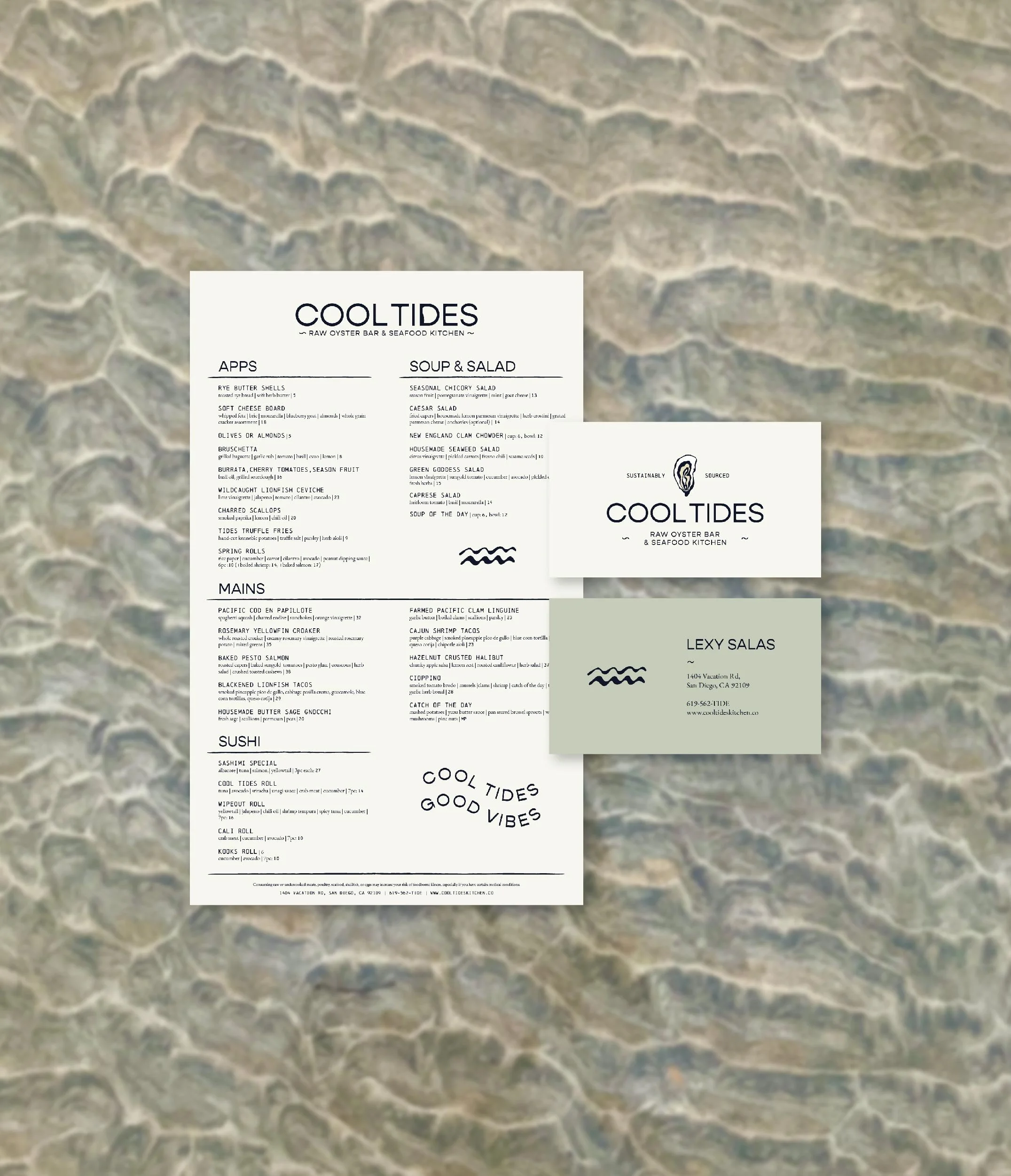
Cool Tides as a brand was heavily inspired by the Pacific Coast. The fonts that have been chosen reflect the modern, simplistic, yet personal vibe to Cool Tides. It has a hip vibe to it, but it also has a touch of that handstamped, handwritten feel to it through the use of organic lines and textures. The primary oyster illustration was obviously born from the fact that Cool Tides is a raw oyster bar. It is modern, yet organic and simplistic. The bold contrasting lines symbolize the bold flavors of the food. The organic lines represent the silky texture of the oyster meat. The colors are likened to the mild, saltiness of the oyster.
Brand Strategy | Moodboard | Color | Type | Logo Variations | Brand Marks | Patterns | Creative Direction | Social Media Content | Business Cards | Menus


LOVE NOTE
This project is fictional, but I imagine my client would say something like “Wow, you captured us perfectly!” ;)


Let’s bring your vision to life.