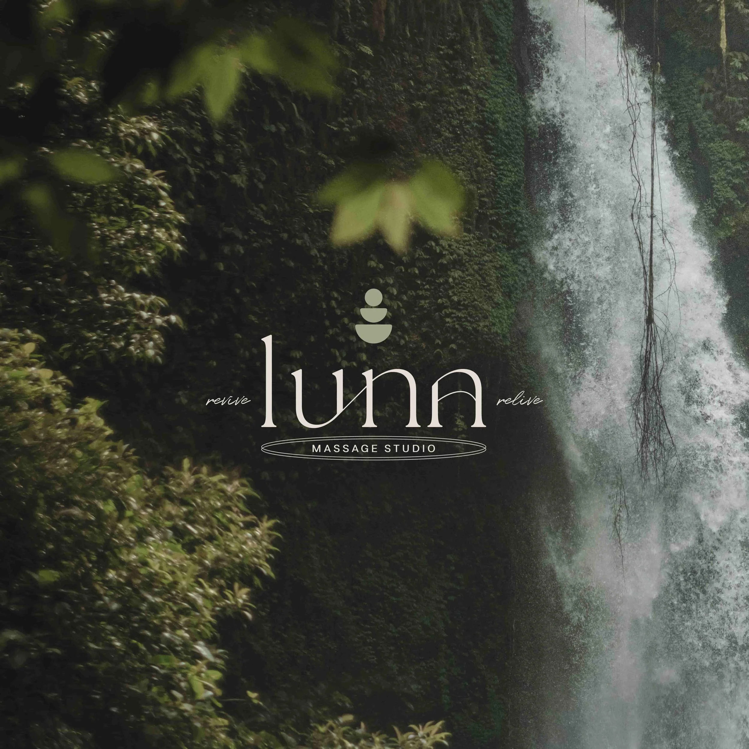
This is Luna Massage Studio. They believe everyone deserves to feel their best- their hands are the only form of pressure you need in your life. Luna is a collective of highly-trained and experienced individuals that specialize in numerous techniques to release tension and revive muscles. They provide their clients with a relaxing, reliving experience by transporting them to an oasis of tranquility.


DESIGN NOTES
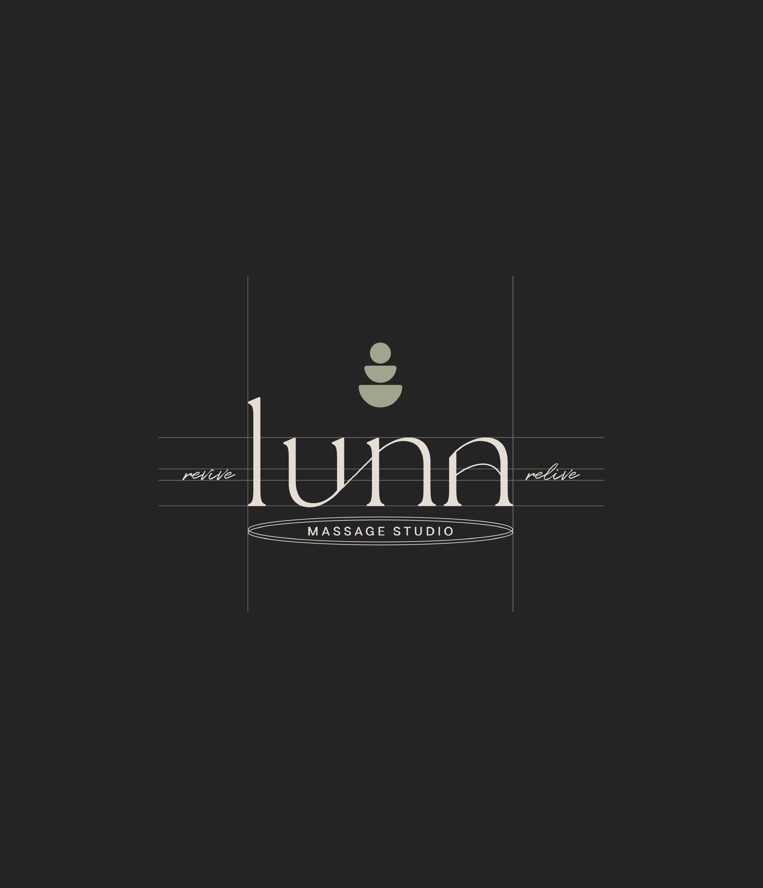
Luna’s graphic icon was inspired by cairns and the moon phase. In the past, several cultures used cairns to mark routes to safety, food, and villages. Similarly, their graphic icon serves as a recognition cue to their retreat/oasis/safe space. In addition to representing the name "luna," the moon phase symbolizes healing, consistency/ritual. The icon has a subtle outer texture to give a raw, natural, Aztec feel to the logo. The logotype is a custom font with soft serifs to represent luxury and reliability. Flowy lines within the font and around “massage studio” create a sense of energy, movement, and consistency.

Brand Strategy | Moodboard | Color | Type | Logo Variations | Brand Marks | Creative Direction | Business Cards


LOVE NOTE
Lexy is a very bright & creative entrepreneur. Loved the breakdown of the strategies she created for my business. She customized my business brand identity & it’s helped me identify who my target audience is- perfect for social media. She went as detailed as to create these “personas” to help me get a different pov of my ideal client. She is absolutely punctual on deadlines so it made it very easy to work with her. Thank you Lexy! You are both brilliant and beautiful inside and out.


Let’s bring your vision to life.