
Fervor is an online shop with delicately curated vintage clothing and home goods that embody drops of sunlight. Driven by passion, they scavenge for unique and quality vintage goods that will make you radiate from within. They prioritize slow-living and appreciate beautiful and raw moments in life. Fervor is an opportunity to reverse fast fashion, preventing items from rotting in landfills.


DESIGN NOTES
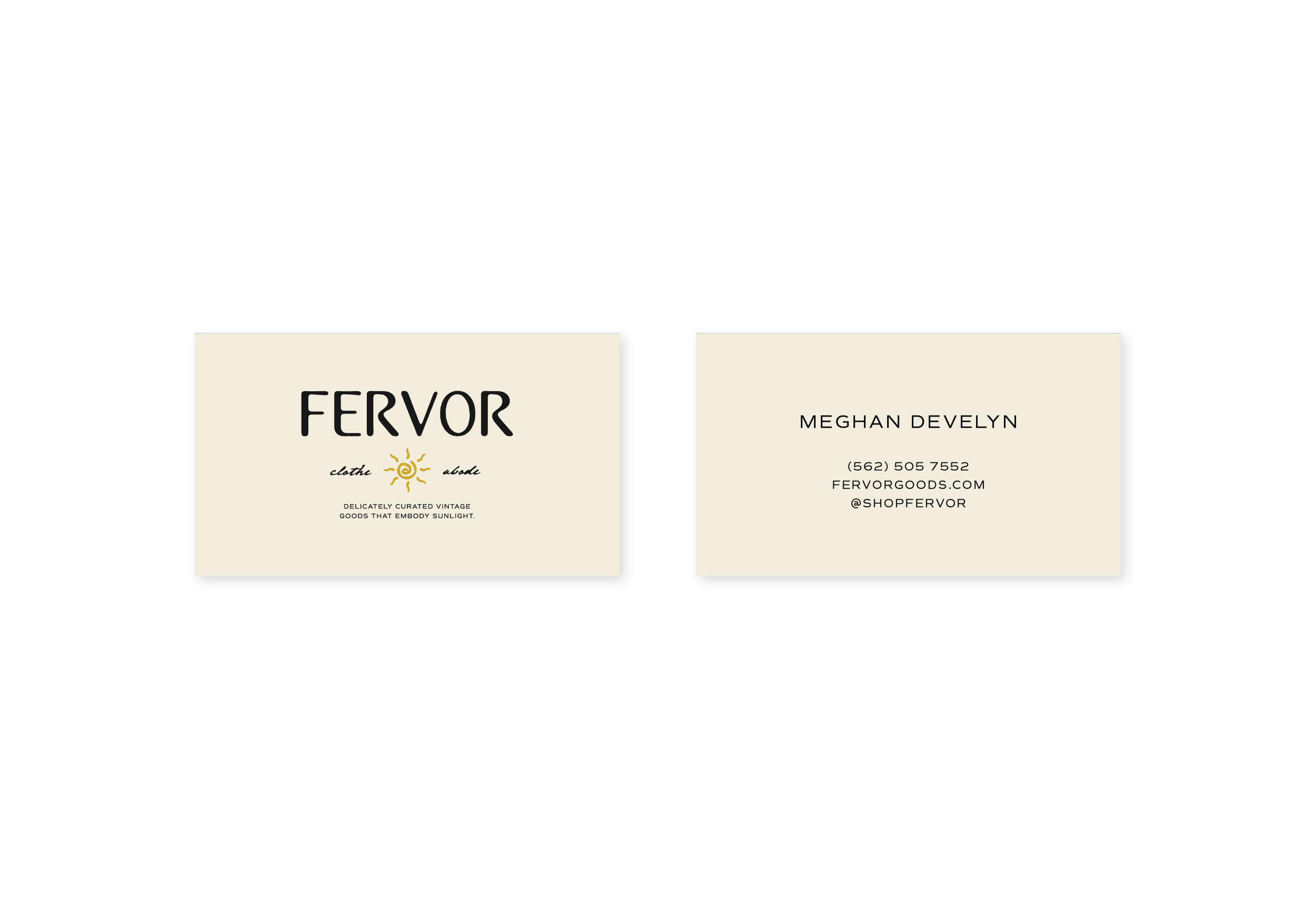
Fervor’s logo typeface, while minimal to express their primary style, incorporates soft and flowing curves reminiscent of seashore ripples. The outer edge has a subtle texture, adding a touch of authenticity and rawness that gives the logo a thoughtful and natural feel. The sun is an iconic representation of Fervor's radiance, which emanates from their brand and collections. These goods “embody sunlight” as they come from a place of positivity and good vibes. The sun also holds a special place in Meghan's life, serving as a constant source of motivation and inspiration. The spiral symbolizes the continuous increase in passion, derived from the Latin word "Fervere," which means "to boil." By fusing the sun and spiral together, Fervor's logo embodies the brand's infinite passion.

Brand Strategy | Moodboard | Color | Type | Logo Variations | Brand Marks | Illustrations | Creative Direction | Social Media Content | Business Cards | Signage


LOVE NOTE
“Omg I barely glanced at the first page and I’m already obsessed… Lexy, I just reviewed the brand presentation and assets. Thank you so much for your hard work and thought that went into this. You’re so great at what you do and I’d highly recommend you.”


Let’s bring your vision to life.